Introduction
The FCC Broadband Label project aimed to create a clear, user-friendly label to help consumers understand broadband service offerings by providing essential information in a straightforward format. The Federal Communications Commission (FCC), an independent U.S. government agency, requires that providers display accurate, easy-to-understand information on the cost and performance of high-speed internet services, similar to nutrition labels, by April 10, 2024.
To comply with these new regulations while maintaining a consistent user experience, we proposed a scalable design structure adaptable for all nine Verizon brands—Total by Verizon, Walmart Family Mobile, Straight Talk, Tracfone, Simple Mobile, Safelink Wireless, Net10 Wireless, Page Plus, and GoSmart Mobile.

My Role
I led the UI design process, focusing on UX/UI with a particular emphasis on UI, which required extensive exploration and effort. I generated various design options and explored different mechanisms to create the final product. This project was conducted under the Verizon Consumer Group (Post-paid and Pre-paid), and the design strategy and UI framework were implemented across the following brands: Total by Verizon, Tracfone, Straight Talk, Simple Mobile, Walmart Family Mobile, SafeLink, Net 10, Go Smart Mobile, and Page Plus.
Approach
1
Present offerings
transparently
2
Empower customer
choice
3
Avoid friction against
customer goal
Research and User-Centered Design
We began by conducting thorough research to understand the FCC’s requirements and the needs of broadband consumers, using existing nutrition labels as inspiration. Our user-centered design process, supported by the research team, included user interviews and usability testing to ensure the labels were intuitive and informative.
Design and Development
I designed a framework that was scalable for all 9 Verizon brands: Total by Verizon, Tracfone, Straight Talk, Simple Mobile, Walmart Family Mobile, SafeLink, Net 10, Go Smart Mobile, and Page Plus. This framework included design templates, guidelines, and components that met FCC requirements.
Collaboration and Integration
Collaboration with cross-functional teams, including marketing, legal, and technical departments, was crucial. This ensured that all aspects of the labels were compliant with regulations and aligned with business objectives. In addition to the Experience Design team, many other teams played significant roles in this initiative, including Legal, Compliance, Engineering, Experience Management, Marketing, Digital Operations and Metrics, UX Research, Quality Assurance, Content Strategy, Operations and Network, Government Discount Programs, Care, and Training. This extensive collaboration ensured the project’s success by integrating diverse expertise and perspectives.
Challenges
- Designing a templated frame suitable for all brands.
- Identifying and integrating the label into key pages and flows.
- Specifying optimal label placements for clarity and accessibility
Label Placement Wireframing

Plan Grid
Includes all plans in one location. This helps evaluate all available plans for a customer.

Plan Detail
Plan page that includes information about a single service plan and all details relevant to that particular plan.

Plan Selection
Plan selection page during the shop device flow. This page is more transactional than marketing-oriented.
UI Mechanism Study
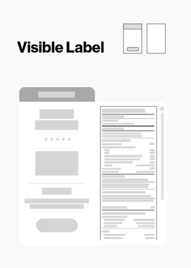
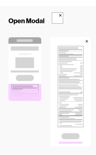
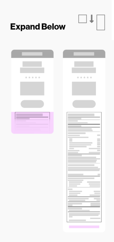
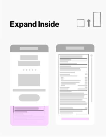
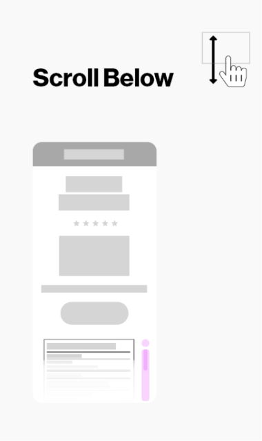
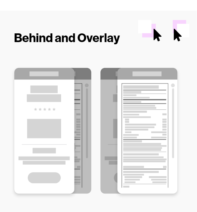
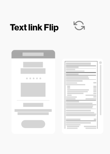
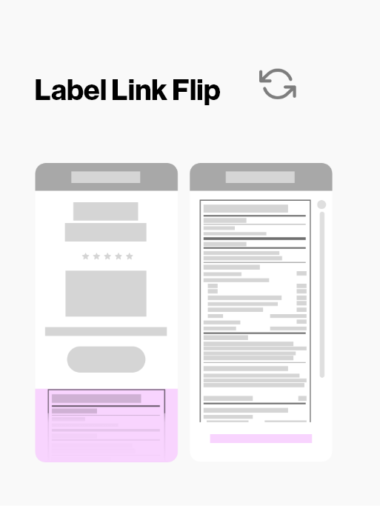


The selected option
Same page - Anchor Link
It maintains current structures on each brand. Adds an easy way to access the FCC BBF label for the customer while being on the same page.

Specifications
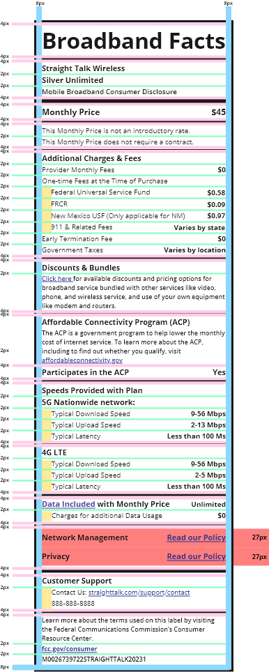
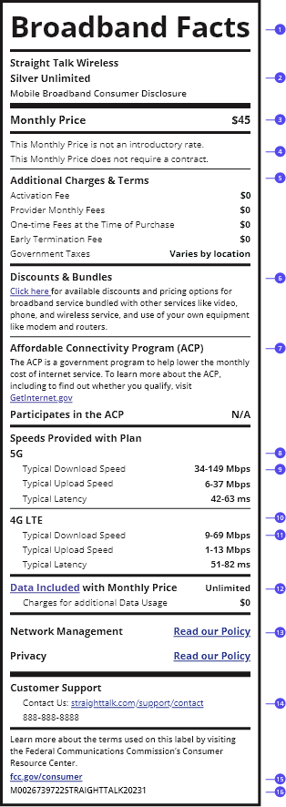
1. FCC Broadband label title
2. Provider name & Plan
3. Pricing content
4. Pricing details
5. Additional charges & terms
6. Discount & Bundle content
7. Discount & Bundle content
8. Plan speed details for each network
9. 5G Ultra Wideband network details
10. 5G Nationwide network details
11. 4G LTE network details
12. Service Data details
13. Policy and Legal links
14. Customer service links
15. FCC links
16. Unique plan identifier
Final Results


Results, Impact, and Learnings
The implementation of the FCC Broadband Label project resulted in significant positive outcomes. All nine brands under the Verizon pre-paid umbrella successfully adopted standardized labels, enhancing transparency and user trust. The labels provided clear and concise information about broadband services, which improved customer satisfaction and decision-making. User feedback indicated that the labels were easy to understand and informative, leading to a smoother customer experience. The project also ensured compliance with FCC regulations, demonstrating the company's commitment to regulatory standards and consumer rights.
Initially, there was a concern that the new labels might negatively impact customers, but this hypothesis proved incorrect. The design decisions made were optimal for all nine brands. Working closely with other design leaders allowed us to discover new perspectives and opportunities for growth. Collaborating and finding innovative solutions to complex challenges is something that motivates me. I thrive on connecting and simplifying experiences that provide value to both the customer and the company, striving for win-win scenarios.

