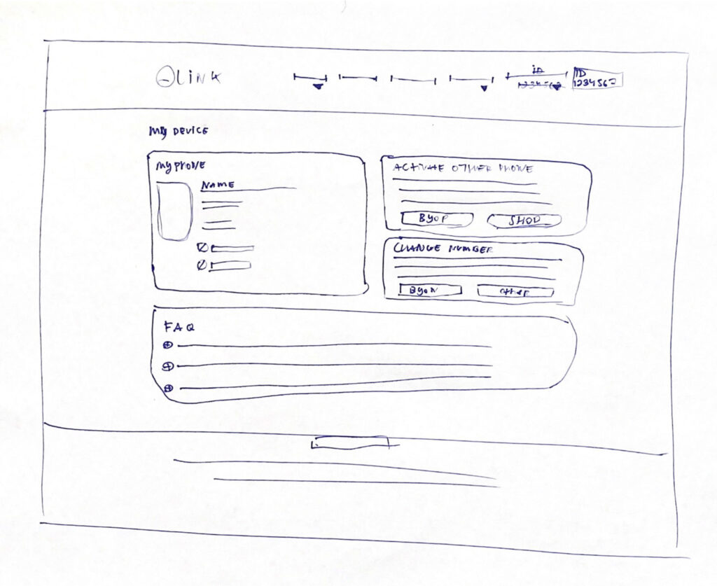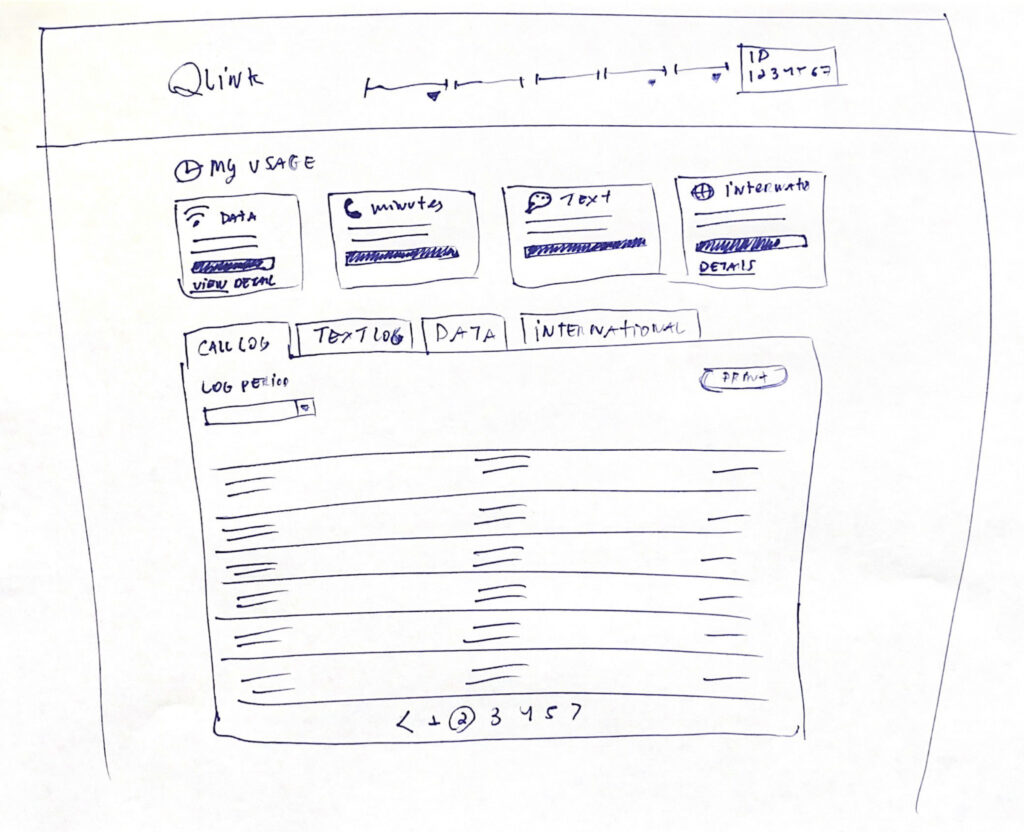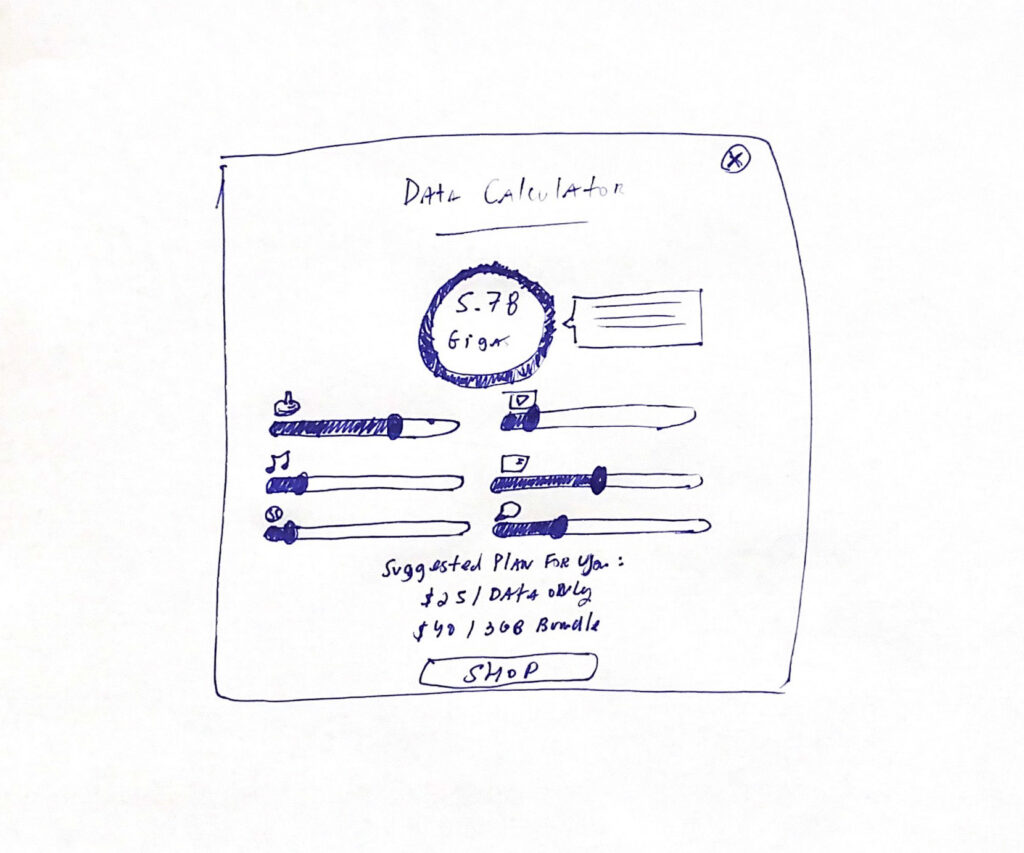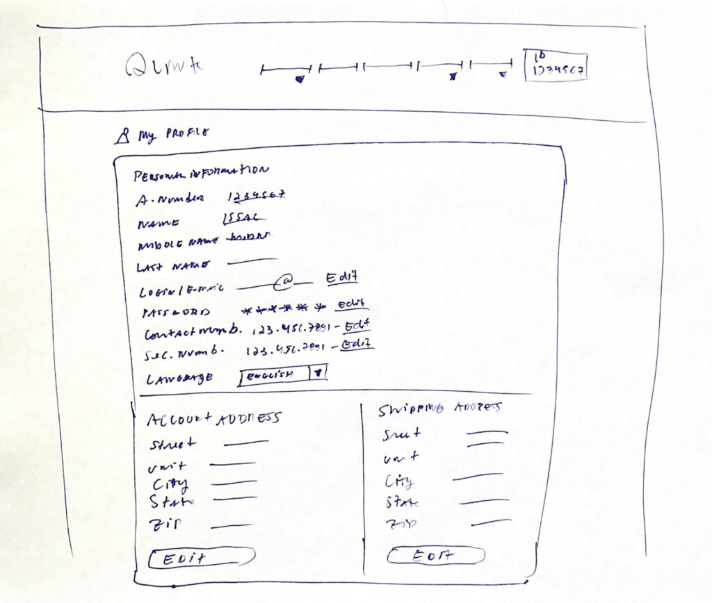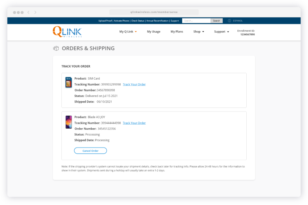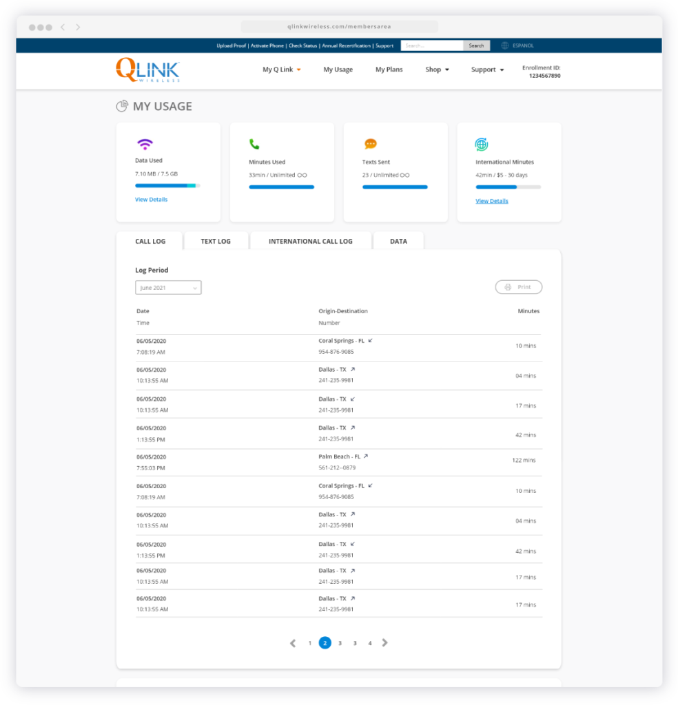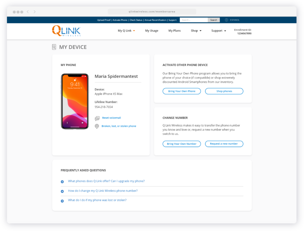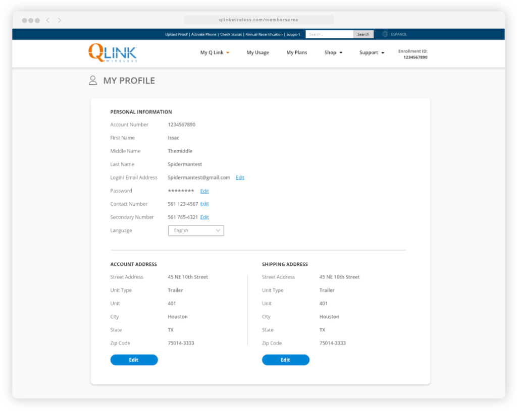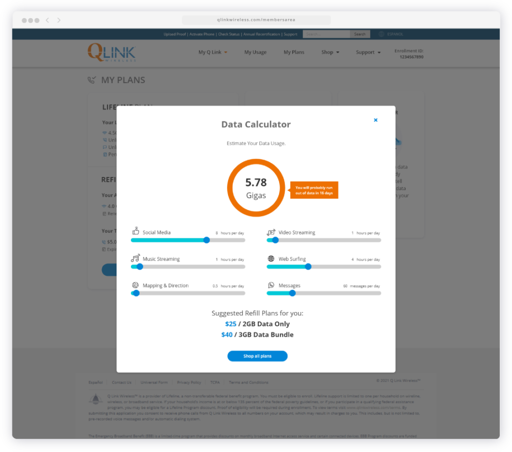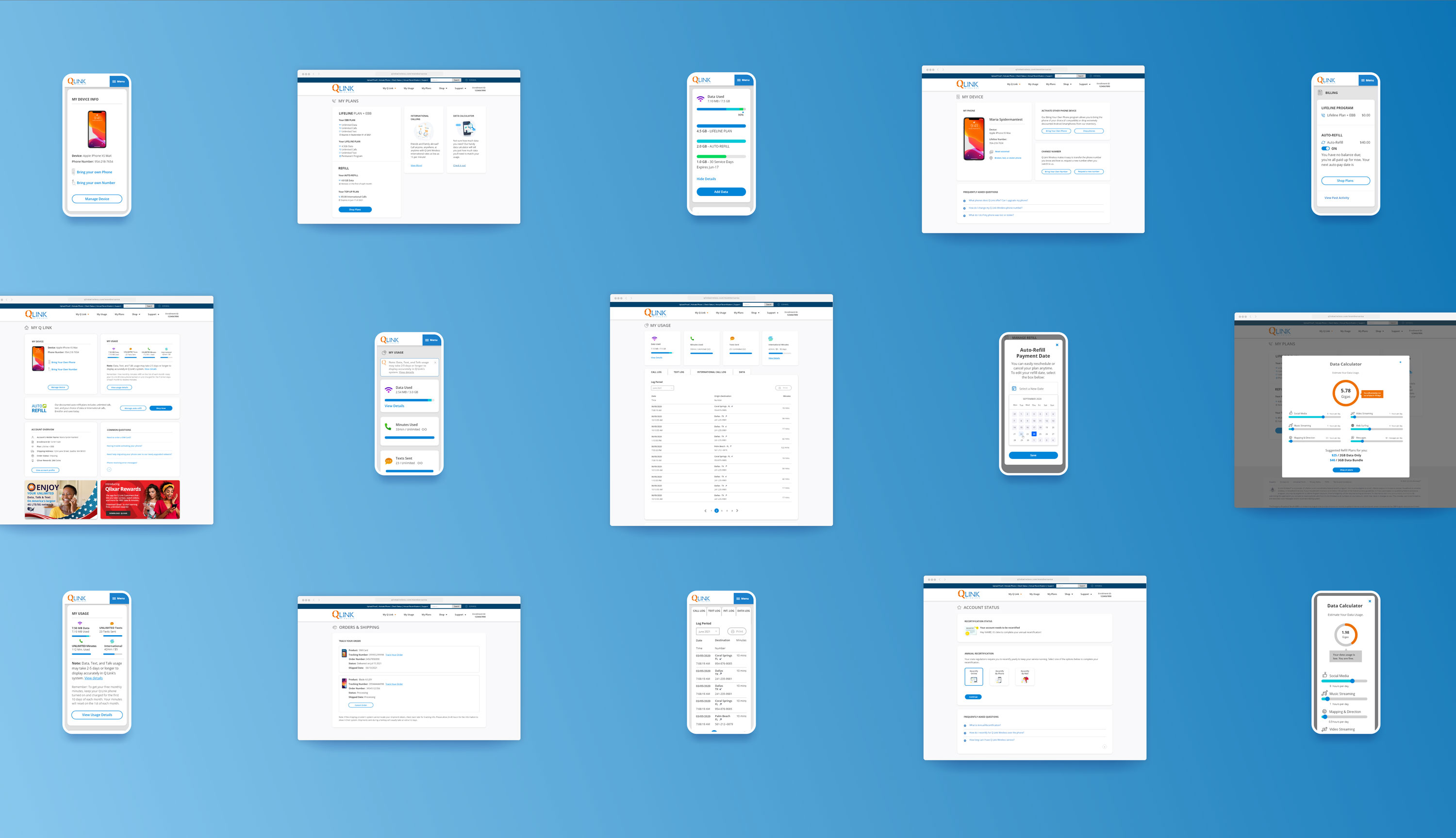
The product
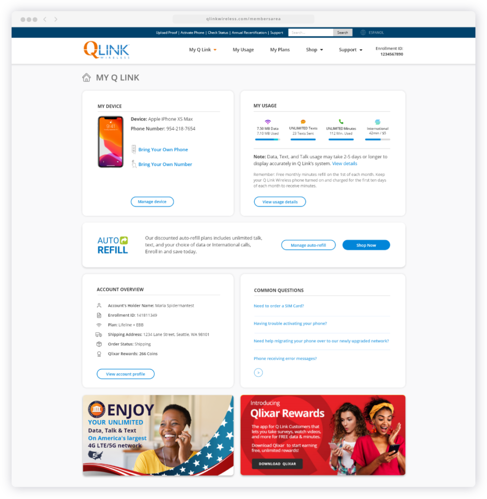
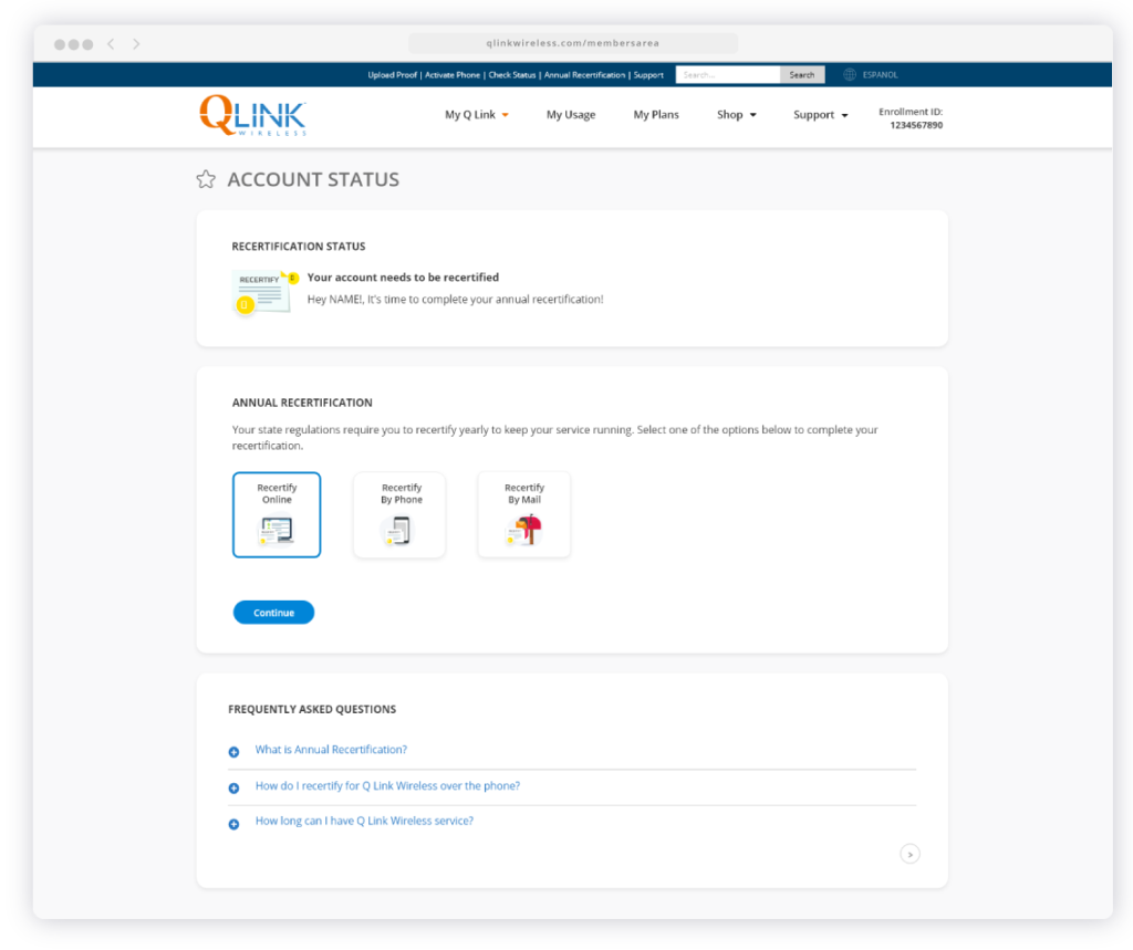
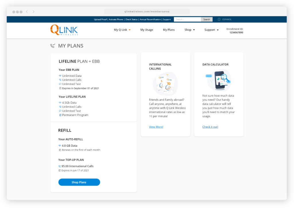
Q Link wireless is the major telecom company provider of free phone service for low income Americans. The Members Area is a web application that basically enables users to manage their phone service, while also keep them informed on any relevant updates.
Project Duration
This project was designed between June and July of 2021 and was currently paused, awaiting the start of development and implementation.
The problem
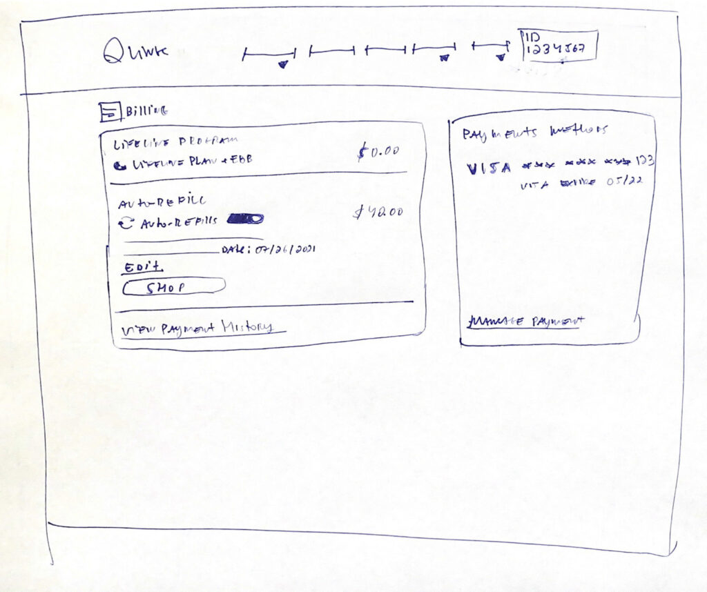
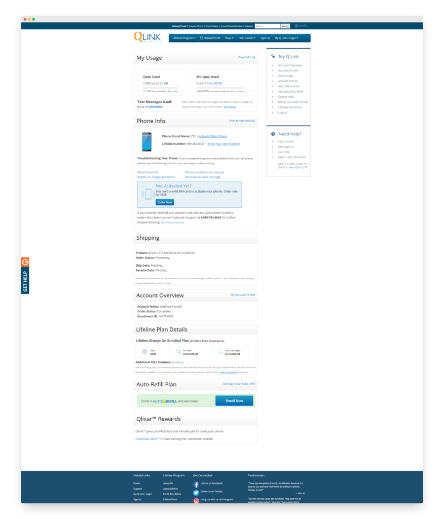
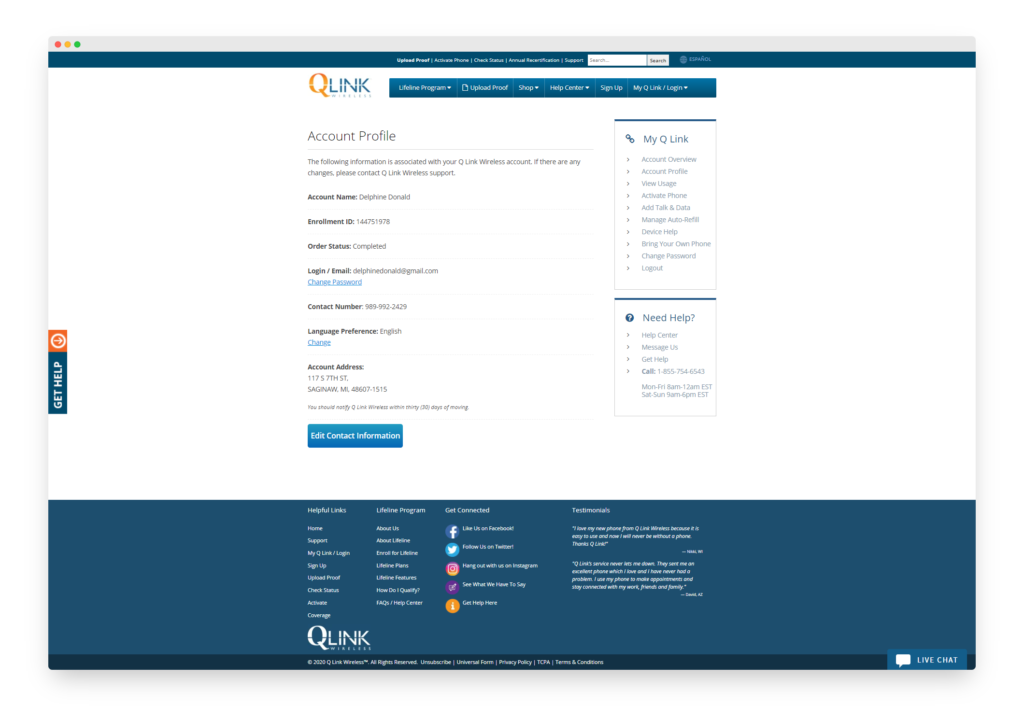
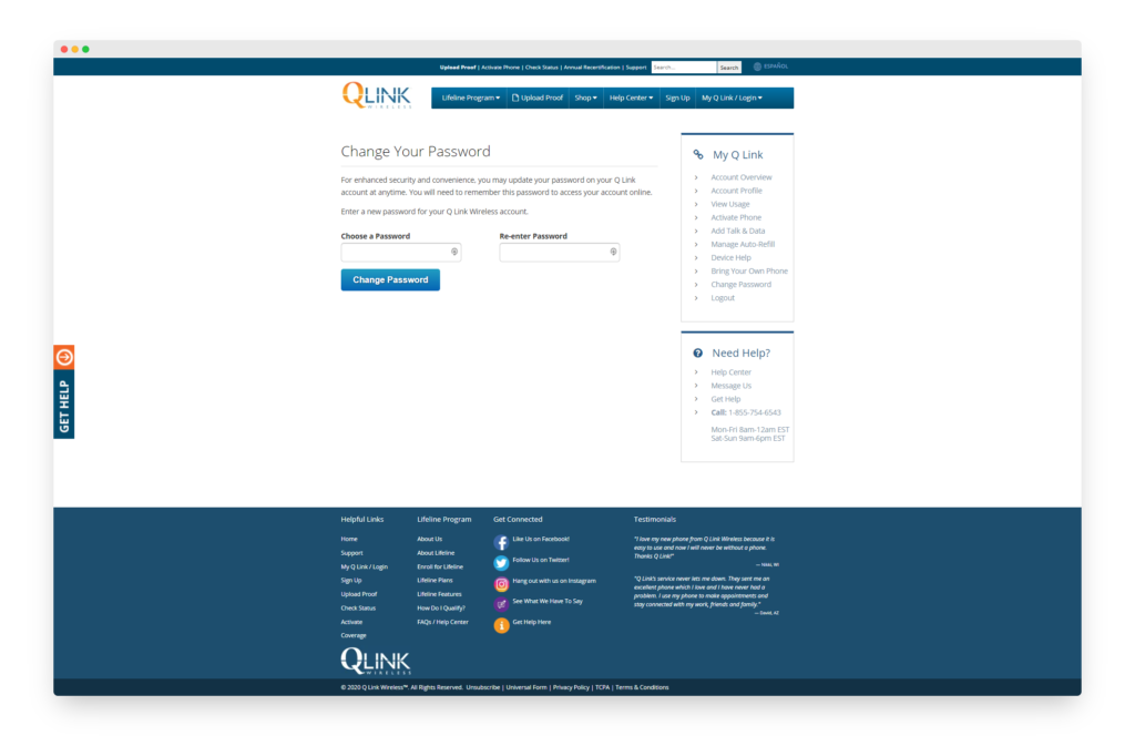
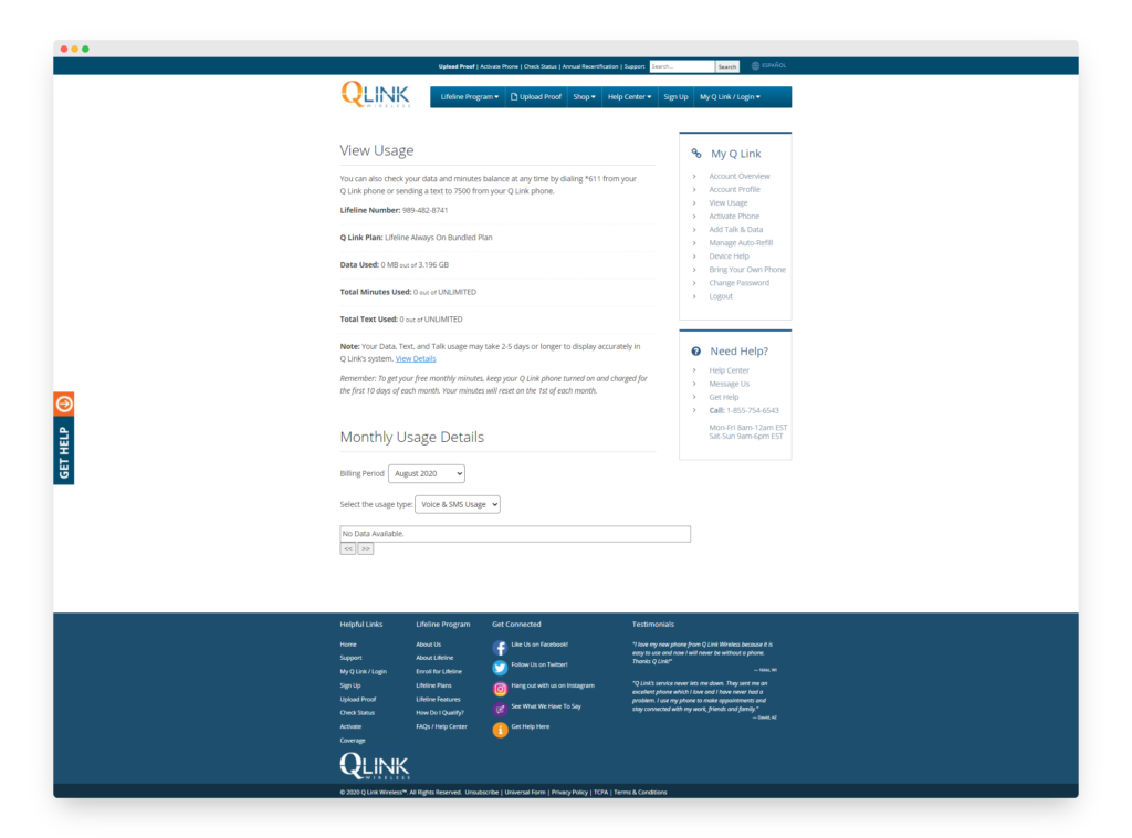
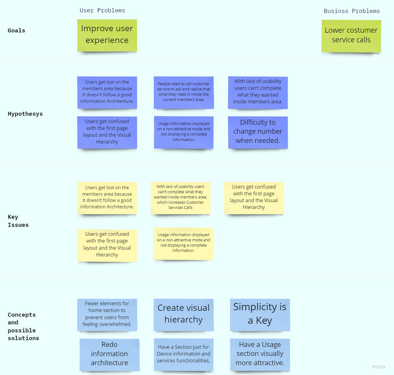
This is the first redesign of the Members Area after several years. The current members area was built over several years adding different functionalities as the company was growing and as the user's need intended to be solved, as a consequence, there is a sum of functionality. While observing the big picture it was possible to diagnose a lack of usability, unclear informational architecture, and a poor user experience.
The goal
The goal was to redesign the Members Area for a better user experience, reassuring them that they’ve made the right decision and consequently increasing user retention.
My role
I worked on this project from data analysis to design, uncovering Google Analytics, website tracking information, feedback from users & customer service, and establishing functionalities requirements together with managers and developers. Our team included developers, an IT manager, a marketing manager, and myself as the UX/UI designer.
Responsibilities
Analytic Synthesis, Information Architecture, and Prototype.
Understanding the user
The research on the project was done mainly analyzing the customer’s needs and behaviors beyond several year of data collection with tracking information, google analytics, and feedback from users through customer service and stakeholders detailing.
Prototype

