Overview
Objective:
The main goal of this project was to test a new approach to increase revenue by offering customers the option to purchase service plans upfront for multiple months at a discounted rate. This approach aimed to reduce churn, increase customer retention, and boost overall revenue. By allowing customers to pay for several months in advance, we aimed to improve customer satisfaction by providing convenience and value.
Challenges:
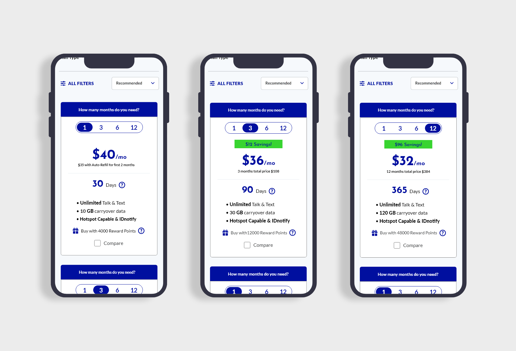
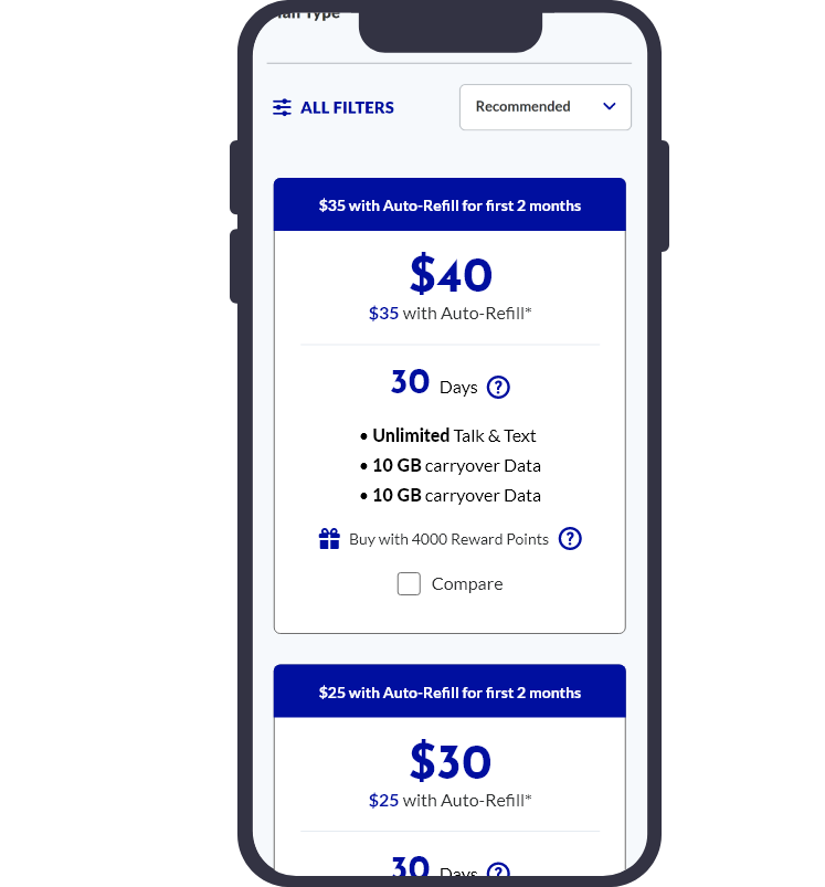
The key challenge was designing a user-friendly interface that allowed customers to easily select a multi-month plan, understand the discount offered, and maintain the familiar card design. The goal was to make this new option seamless and attractive without overwhelming the user.
Role:
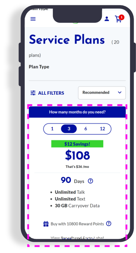
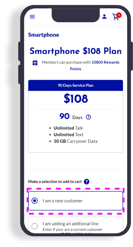
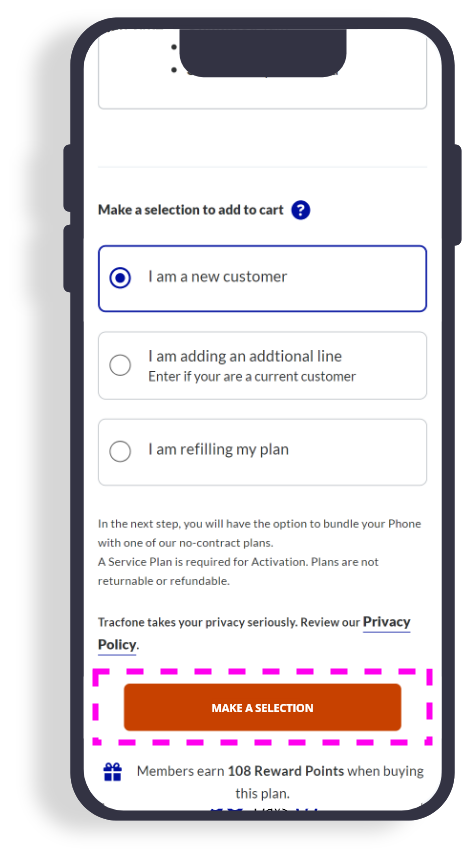
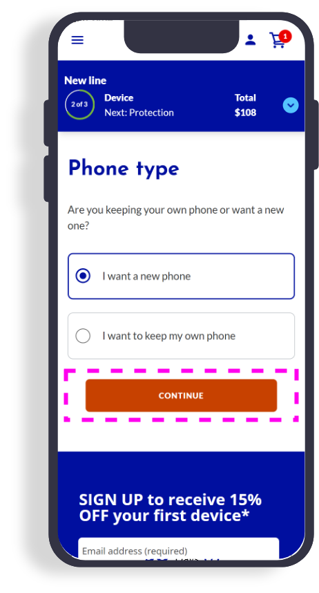
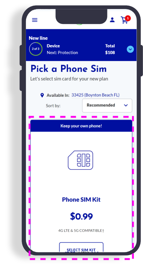
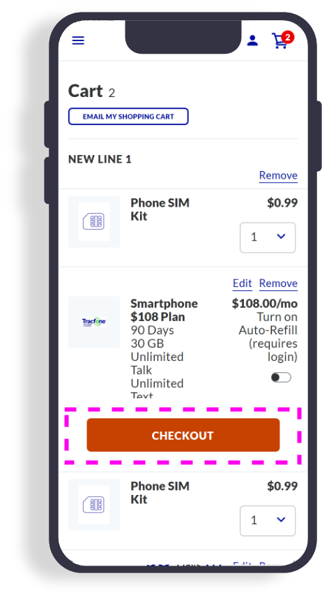
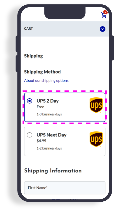
I was the sole designer on this project, leading both the UX and UI design processes. My responsibilities included sketching initial ideas, creating wireframes, and developing a navigable prototype that aligned with the brand’s existing design language. I focused particularly on the PLP page (the plan card) and the PDP page, while also implementing minor changes throughout the rest of the checkout process, right up to the confirmation page. My primary objective was to maintain a consistent and familiar design structure while seamlessly integrating the new multi-month plan options.
Process
Design Process:
The primary UI challenge was to incorporate the option to select a multi-month plan while clearly displaying the discount information. I began by sketching a few concepts and then moved on to wireframes.
Collaboration and Stakeholders:
This project was a direct request from the business team, who wanted to pitch the idea to the executives. They had approval to expedite the process, so speed was prioritized over a traditional, iterative design approach. I created a prototype in just two days, which was used to test the concept with real customers.
The business team fast-tracked the project, moving it from prototype to live testing with actual customers. This allowed us to gather real-world data and feedback.
Testing:
We conducted both live testing with real customer interactions and usability tests. The live version is gathering long-term data on customer retention and purchasing behavior over 6 to 12 months. Early results were positive, and usability tests provided valuable insights that reinforced the design's effectiveness.
Outcome
Final Solution:
The final design maintained the integrity of the existing card structure while adding a multi-month selection feature. It enhanced the purchasing experience by offering discounts without complicating the user journey.
Impact:
The initial trial was successful, and the feature remains live. Following the initial launch, usability testing was conducted with both existing and potential customers. The feedback was overwhelmingly positive. The primary focus for analysis was on long-term metrics such as customer retention and purchasing behavior, which are being monitored over six months to a year.
Reflection
Learnings:
This project highlighted that live customer interactions can sometimes provide deeper insights than traditional usability studies, leading to more effective, data-driven decisions. Additionally, the experience reinforced the importance of adaptability in the design process, as the need to quickly pivot and develop a functional prototype under tight deadlines was crucial for success.
Next Steps
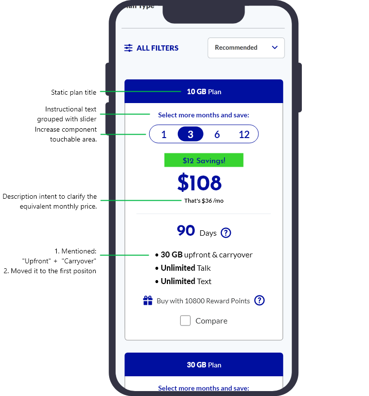
A refined version of the prototype was designed based on user feedback and observed behavior. Key updates include:
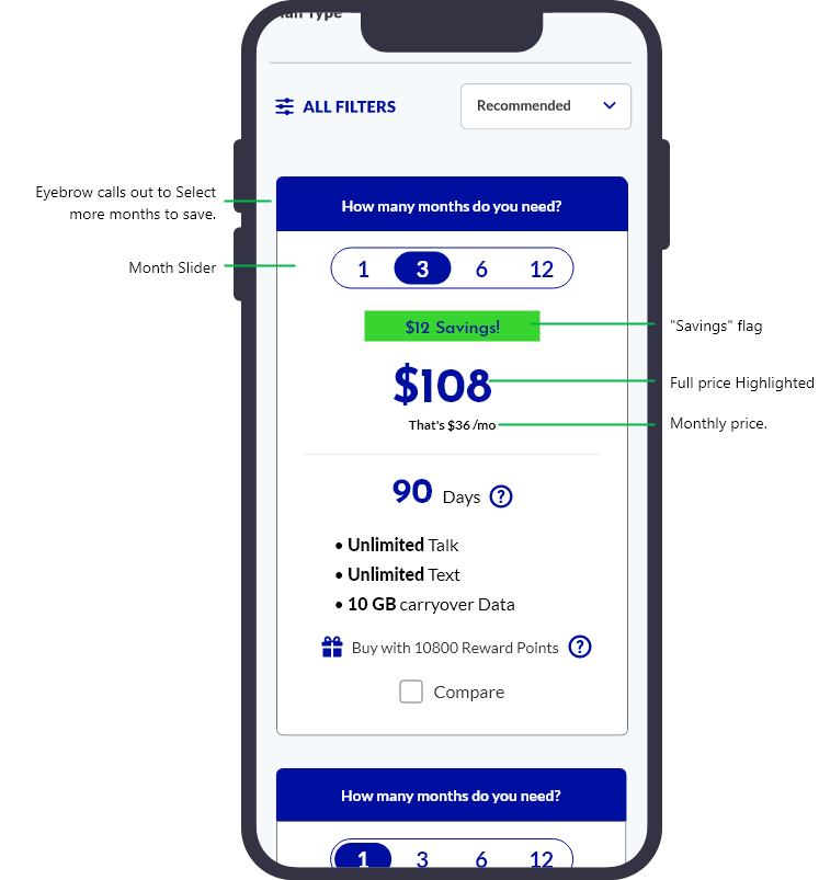
- Improved Information Hierarchy: We observed that the Eyebrow section often receives less user attention. By repositioning the plan title to this section, we aimed to establish it as a secondary hierarchy level. Additionally, moving the instructional text 'Select more months and save' and grouping it with the month selector would create a more intuitive connection between the action and its benefit.
- Component Accessibility: Another proposed adjustment involved increasing the touchable area of the components to ensure that users could easily interact with the month slider, especially on mobile devices. This change aims to improve overall accessibility and reduce the likelihood of user frustration during the selection process.
- Copy Clarification: The modification from “That’s $36/mo” to “That’s equivalent to $36/mo” was made to eliminate any potential confusion about the payment structure. This adjustment ensures that users understand they are paying the full amount upfront and not on a monthly basis.